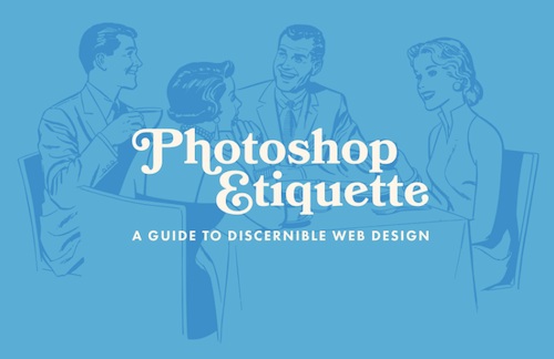
How Photoshop Etiquette Provides Guidance in Developing Responsive Websites
Photoshop Etiquette can be defined as a sort of “Best Practices” guide that helps in bringing clarity to the web designing approach. It is primarily engineered for Photoshop; however, it has also proved effective for other layer-design based tools like Sketch. 
The Etiquette Guide comes with the following sections: sections:
- Layer structure
- File organization
- Asset exporting
- Effect application
- Type execution
- Quality check
With Photoshop Etiquette, you can figure out a wide range of essential responsive resources along with the guidelines to use them and also tips on designing responsive sites using these options. Here are some tips taken from Photoshop Etiquettes that can prove to be effective while designing websites for multiple devices.
Consolidating the PSDs
If you are developing multiple comps for multiple set of pages, availability of art board in Photoshop tool allows you to stick to one single document. It helps in eliminating the confusion to pick the correct PSD. The Photoshop Etiquette helps you in guiding through the process in an easier and faster way. 
Don’t’ opt for device-specific designing
Well, this is crucial. You must not design a website focusing on a specific device. If you are designing a responsive webpage, ensure the designing part is not imitated from a device-specific design structure. Rather, it would be better to allow the design to dictate several breakpoints. However, there would be exception only if you are designing a device specific or platform specific website or web application. 
Maintain a collaborative approach during work
It becomes easier to share assets between two or more designers of a team with the help of Linked Smart Objects and Creative Cloud Libraries. Suppose you are working or a Photoshop project to create a component or pattern guide, one member of the team can work on a specific component while another one can work on a different component simultaneously. The components can be easily shared as Linked Smart Objects or within the Library that can be then pulled into master PSD.
Focus on screen resolution
With the introduction of SVG, it becomes possible to create an object that can easily adapt to any size without losing the fidelity part. Every responsive web designer works with Retina Asset based Workflow to auto adjust the screen resolution as per the devices.
Always remain non-destructive in approach
The tremendous popularity of SVG has made it certain that designers must sustain the vector assets while working in Photoshop and not try flattening them. Since Photoshop eliminates the option to save SVGs, designers will remain non-destructive while working with the pixels.
Image Compression
Compressing the images without losing on the quality is necessary. When including images into responsive web pages, it must be ensured that the compression part is handled perfectly. Use of third-party tools like Tiny PNG can be used for effective image compression purpose.
With every innovative concept evolving, the web designing workflows will continue to change and top web design India companies are some of the finest examples of innovation when it comes to creating something unique “out of the box”. Similarly, Photoshop will also include new features and functionalities, while bringing in quite a few changes with every single update. The Photoshop Etiquette Guide will also go through the change to catch on the momentum. The primary focus of Photoshop Etiquette is GROWTH. This can be made possible through manifesting more resources, perspectives, and guidelines.